We hear it constantly, and often in military terms: We are being bombarded by information. Our senses are under assault. Our attention spans have been decimated. Marketers and educators alike are instructed to “cut through the noise,” but…wait. Isn’t there another way to look at this?
It’s true that as potential consumers, we’re processing far more sight-and-sound “attention requests” than ever before, and with little respite. Also true is that we rarely navigate long blocks of text to get to the “aha” of an item anymore. Instead, a broad array of diverse, creative information-conveying techniques competes for our commitment—offering us the option of skimming or diving—and each technique teaches us, afresh, how to navigate it.
Infographic culture, in other words, is not an assault on attention spans or on the concept of deep learning. It is, in fact, making us faster, deeper, and more flexible learners.
1) We’re faster across the top.
In a competitive visual landscape, our brains are under pressure not only to process top-line messages quickly, but also to make lightning-quick decisions about which items to pursue and which to pass over. In this context, shorter attention spans aren’t necessarily a bad thing: they just mean we give things a shorter “trial period” before we move on. They also indicate that consumers are getting better at sifting through countless “information offers,” discarding the weak or irrelevant, and diving into the best and most pertinent ones for deeper learning.
2) We go deeper down the middle.
Once a user has selected a “dive,” a good infographic—particularly a robust, interactive one—can convey far more complex data, far more efficiently, than pages of text. While traditional education has long relied on reading and listening—a purely linguistic learning experience—data visualization and interactive infographics scoop up the rest of the learners, and manage to convey profound layers, dynamics, and interconnectivity that would be difficult to demonstrate in any other way.
3) We’re becoming cognitively flexible, visual polyglots.
There is no standard “key” to infographics; no specific, common code. This means that every infographic we encounter speaks its own language, and a good infographic will teach you how to read it. It may use color; shape; size; orientation; flicker; or other visual cues to convey quantity; trends; correlation; relativity; chronology; hierarchy; and more. The best infographics should, of course, feel “intuitive”—the brain should be able to guess, without effort, how to process them—but the more diverse infographics and data-visualization “languages” we encounter, the better we get at reading them, and the more visually fluent and cognitively nimble we become.
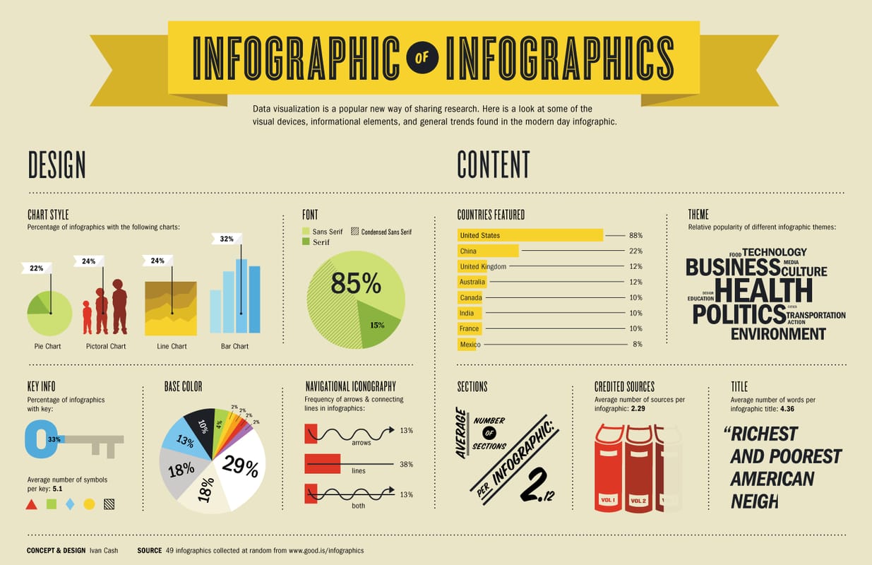
Infographic on infographics by Ivan Cash
Become a Member
Being a member of the Chicago Humanities Festival is especially meaningful during this unprecedented and challenging time. Your support keeps CHF alive as we adapt to our new digital format, and ensures our programming is free, accessible, and open to anyone online.
Make a Donation
Member and donor support drives 100% of our free digital programming. These inspiring and vital conversations are possible because of people like you. Thank you!